Sunday, October 21, 2012
Saturday, October 6, 2012
The Line
As someone who started altering photos at the age 12, I've always been aware of the possibilities and dangers of photo retouching. Of course, as a 12 year old, I had no idea the extent that some people took the technology.
I think my dad sent me the Dove Evolution video back when it was first making its rounds on the internet, because it was definitely not new to me. The first time I watched it, I remembered being simultaneously impressed and disgusted. On the one hand- isn't technology insane?? You can make someone look like an entirely different person with just a computer. As an added bonus- it looks totally natural. As someone who spent three years trying to Photoshop herself into pictures with Liam Aiken and make them look real, I can appreciate that skill.
Cough.
 On the other hand, that skill is obviously being abused. As a woman (young lady? girl? female person?) the idea that those insane standards of beauty that I'm held to aren't even real is incredibly frustrating. Dove put it well- "No wonder our perception of beauty is distorted." Just from a female perspective, this power of Photoshop is dangerous when men are in charge of how they think women should look- realistically or not. I don't think you'll ever find someone who doesn't find this as our modern age's version of gender marginalization.
But of course, technology has now progressed to the point that if it won't right its wrongs, it can at least recognize them.
I didn't realize that we were at the point where we can actually quantify how much retouching has been done to a particular picture- and as a tech fangirl, I am, again, impressed. But what impressed me even more was the idea that someone out there is trying to make "photo alteration standards" a thing.
In my head, like with tobacco products, every photograph that uses significant photoshopping would be labeled. "This photo has been photoshopped." Even better- it would tell you where exactly the photo was retouched. "Warning: the ears in this photo have been made smaller."
This isn't just important on the basic human decency level- altered perceptions of beauty have real consequences. According to the Daily Mail and the American Medical Association, "a large body of literature links exposure to media-propagated images of unrealistic body image to eating disorders and other child and adolescent health problems." Yeah, no kidding. And even when you don't count all of the cases of physical health problems caused by these altered images, just imaging what it's doing to the young psyche. For every girl with anorexia there are ten with horribly low self esteem. There is no good that comes from this kind of advertising.
I tried to keep all these things in mind when I did my own photo retouching for this assignment. Below is the before and after versions of a photo I took of my friend Ellen during a game night.
 I tried to just focus on the normal stuff for this retouching- minor skin imperfections, brighter eyeshadow, better color contrast, the kind of things you would try to cover up with makeup on a regular day.
There was a weird gray tint to the whole original picture, so I tried to even that out with some more red and blue. I used both the healing spot tool and the healing brush to remove some various acne and moles, then I used the clone stamp tool to make her bangs cover all of her forehead, instead of having two weird bald spots. Little things, perhaps, but I think it gives her hair a fuller look overall.
I also whitened her teeth a bit and retouched her eye shadow (I know what colors she uses so that was pretty easy- plus matching the shade I knew she was already wearing made it look more natural) with just the paintbrush tool set to a low opacity.
I used liquify mostly for the sake of using liquify, and the only things I did were make her smile a little wider and make her ear a little bigger (doesn't her ear look weirdly tiny in that first shot?). I didn't think she needed much more than that, though. She's a pretty good looking lass on her own.

The only other think I did was use the burn tool to darken the background so that you could focus on her face more, but that was just sort of random and last minute.
Overall I think this retouching was successful, because she still looks like herself, just with freshened up makeup and maybe a bit of skin clearing lotion. And that's the direction I think photo altering should be going- enhancing someone's best qualities instead of replacing their lesser ones.
I think my dad sent me the Dove Evolution video back when it was first making its rounds on the internet, because it was definitely not new to me. The first time I watched it, I remembered being simultaneously impressed and disgusted. On the one hand- isn't technology insane?? You can make someone look like an entirely different person with just a computer. As an added bonus- it looks totally natural. As someone who spent three years trying to Photoshop herself into pictures with Liam Aiken and make them look real, I can appreciate that skill.
Cough.

But of course, technology has now progressed to the point that if it won't right its wrongs, it can at least recognize them.
I didn't realize that we were at the point where we can actually quantify how much retouching has been done to a particular picture- and as a tech fangirl, I am, again, impressed. But what impressed me even more was the idea that someone out there is trying to make "photo alteration standards" a thing.
In my head, like with tobacco products, every photograph that uses significant photoshopping would be labeled. "This photo has been photoshopped." Even better- it would tell you where exactly the photo was retouched. "Warning: the ears in this photo have been made smaller."
This isn't just important on the basic human decency level- altered perceptions of beauty have real consequences. According to the Daily Mail and the American Medical Association, "a large body of literature links exposure to media-propagated images of unrealistic body image to eating disorders and other child and adolescent health problems." Yeah, no kidding. And even when you don't count all of the cases of physical health problems caused by these altered images, just imaging what it's doing to the young psyche. For every girl with anorexia there are ten with horribly low self esteem. There is no good that comes from this kind of advertising.
I tried to keep all these things in mind when I did my own photo retouching for this assignment. Below is the before and after versions of a photo I took of my friend Ellen during a game night.

There was a weird gray tint to the whole original picture, so I tried to even that out with some more red and blue. I used both the healing spot tool and the healing brush to remove some various acne and moles, then I used the clone stamp tool to make her bangs cover all of her forehead, instead of having two weird bald spots. Little things, perhaps, but I think it gives her hair a fuller look overall.
I also whitened her teeth a bit and retouched her eye shadow (I know what colors she uses so that was pretty easy- plus matching the shade I knew she was already wearing made it look more natural) with just the paintbrush tool set to a low opacity.
I used liquify mostly for the sake of using liquify, and the only things I did were make her smile a little wider and make her ear a little bigger (doesn't her ear look weirdly tiny in that first shot?). I didn't think she needed much more than that, though. She's a pretty good looking lass on her own.

The only other think I did was use the burn tool to darken the background so that you could focus on her face more, but that was just sort of random and last minute.
Overall I think this retouching was successful, because she still looks like herself, just with freshened up makeup and maybe a bit of skin clearing lotion. And that's the direction I think photo altering should be going- enhancing someone's best qualities instead of replacing their lesser ones.
Sunday, September 30, 2012
Classmate Self Portrait Critique
For my critique I chose Tom Ibrahim's self portrait project.
Tom's first photo, of the cherries and the basket, was beautiful. I loved the contrast of the dark red cherries and the light colored basket, and the framing was nicely done, because nothing was central to the frame.
The second, of the kayak, was also nicely framed, though I wish the background had been more interesting. It was a cool photo, but because it didn't show something interesting past the bright yellow kayak that was, again, well placed in the frame, I was left wanting.
His third photo was rather disappointing to me, especially after the incredibly interesting first two. The plants he was photographing almost evenly split the frame, a mark of an amateur photographer that could have easily been fixed with cropping, and there wasn't a lot of color contrast, which made it feel like we were just looking at grass.
The fourth photo, of the purple flower, had a nice color contrast and story behind it, but the photo was blurry and that took away from my viewing experience. Fading the saturation of everything but the flower would have been a nice way to hide that and to bring out the contrast better, as well as upping the sharpness and clarity (specifically in camera raw).
The fifth image was fun, and I appreciated the break from nature, because it showed a range in Tom's personality. I liked that the framing of the group was off center, because it gave a sense of movement and fun to a fairly precarious looking trust circle, or whatever it was.
Overall, I really liked Tom's midterm project, and thought he did a good job synthesizing each image for viewers.
Monday, September 17, 2012
Me, Myself, and Color
If you ask anyone who has known me longer than a month, they'd tell you that I love color. My mother, a quilter, loves when I'm home, because I can help her pick fabric for her projects. Though she's in incredible crafts-person, colors confound her and so she turns to me. In addition, my various bedrooms over the course of my life (extending into college) have had one important thing in common: they look like a schizophrenic five year old decorated them, which is to say they have all been very colorful.
As I've aged, however, I've (to an extent) gotten away from the barrage of different shades and patterns on one surface, and started to recognize the simple beauty of minimalism. And when I say minimalism, I don't mean the weird abstract paintings that are one solid color but go for thirty thousand dollars a pop, but the use of accent colors. Remember when there was a big black and white except for one thing fad going on? Where photos would be completely black and white except for one accent image in full color, usually something red, like a rose? Yeah, I really like that.


In fact, I tend to dress similarly, insofar as I wear one article of very bright clothing, like an undershirt or a pair of bright Converse, and then compliment it with duller colors of pants and cardigans. Example: A red tank top with plain jeans and a dark gray cardigan. Highlighting a bright color with duller ones is something I really find appealing. I find that this carries over into my photography and editing style, highlighting a bright color and contrasting it with duller surroundings. Sometimes that's difficult to do, however.
Speaking of contrast, that's another thing I find myself doing, especially in photoshop; upping the contrast between colors and the darker (and less important) surroundings. I find that darkening shadows and really differentiating between the various colors in a picture really helps bring out the details. Take these photos, for example. There is a very obvious and beautiful pattern on the paper crane that is washed out in the original version, but upping the contrast and the blacks slightly helps it, arguably the most interesting part of the picture, stand out.

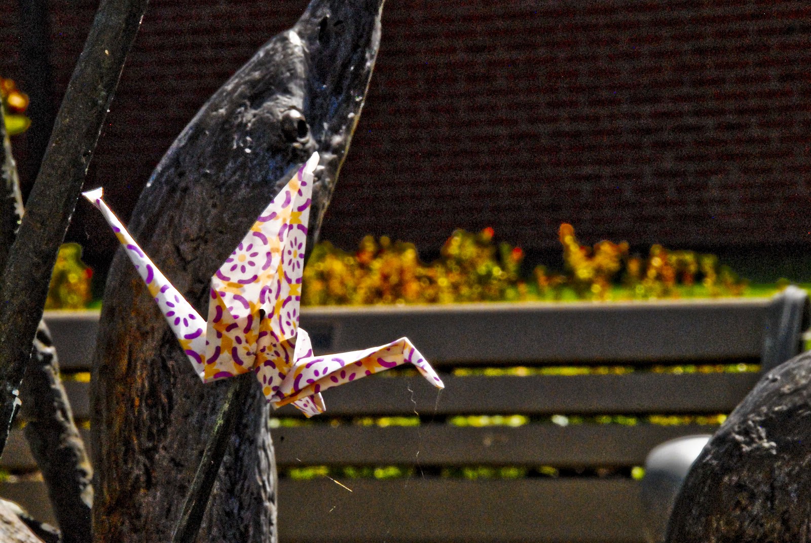
I tend to shy away from altering saturation too much, although in this particular case I think I increased it a bit to help the colors on the paper stand out better. On the whole, however, I find that simply playing with the amount of light on certain parts of the picture is more useful in bringing out the vibrancy of color than saturation.

Overall, the takeaway is that I love color, but I understand that too much of it lessens its impact and overstimulates the viewer. All I can hope is that I don't let my tendency towards the insane overpower my appreciation of the simple.
Self Portrait Midterm
I know I'm a bit early, but I picked my images out last week and had a bit of time to film and edit, so I figured I'd just submit this now instead of stressing later.
Sunday, September 9, 2012
10 famous photographers: RESPONSE
The first thing that struck me about this article was that, in more than one case, the photographs used as examples weren't even from the photographer they were meant to compliment. Why not use of of Annie Leibowitz's ACTUAL photos? It seemed strange to me that a photography blog about photographers used pictures not from those photographers. "This wartime photo is the same genre of photography that Robert Capa shot." The same genre?? Awesome. But since the whole premise of the post was about what you can learn from these specific photographers, was it too much to ask to get an image from that person? "same genre" my ass.
Also, what's with the photographers that didn't get an example picture at all?? Photography is a VISUAL medium, and your advice falls cheaply without an example from the photographer, especially without an example at all.
Overall, this article seemed to wildly oversimplify the careers of some historically and contemporary great photographers, and the "tips" that he gleaned from them were obvious and unhelpful. "Tip: don't stop doing photography." OH THANKS.
I did learn something, though, despite my reservations with the article as a whole. What this whole post basically boiled down to was: don't give up, don't destroy what you've done, and above all else, be passionate about what you do. Regardless of the poor writing, I'm glad I had that takeaway.
Monday, August 27, 2012
Subscribe to:
Posts (Atom)