Wednesday, March 20, 2013

Little Girls and Boys

This is the beginning line to my poem "Optimus Mack"
Fonts used: Hurry Up (gray), Sybil Green (yellow), Baveuse (green)

Version #2:

 Fonts used: Hurry Up (white), Jokerman (yellow), Burnstown Dam (green)

Working with the background:

Monday, March 18, 2013

Fonts and Pictures

Not sure if this what what we were supposed to be working on, but this is my picture/font combo.


A Study in Fonts

1. Constantia.
I was actually looking for Cochin, but the school's photoshop didn't have it, so I settled. I like Constantia because its clean and easy to read, but it's just stylized enough to be unique from the boring, standard Times New Roman. The letters are slightly fatter and spaced, making it a pleasant but readable change of pace.

2. Eras Light ITC
I think I downloaded this font for my portfolio, but I can't remember if it's what I ended up using. Oh well. This is my "text" sans serif font because while it's pleasing to look at and easy to read, it also has a little bit of minimalistic funkiness to keep things interesting. The lines are straight and thin, but when you look at how elegantly the curves in the lowercase "g" and "a"s, it's clear this isn't your grandma's font.

3. Eccentric STD
Unfortunate name, this is my first "display" font because I can imagine it as the text for a Greek diner sign, or maybe a frat party. It has hints of anachronism but manages to look modern, and its tall, thin letters make it interesting to look at. The next time I host a toga party, this will be the header font for my invites.

4. Hurry Up
Don't tell me what to do! This font is technically sans serif, so I went with it. I've slept a total of 5 hours in the past 48. Moving on. I like Hurry Up because it's chunky and playful, with comforting geometric shapes that remind me of my childhood while not making me feel childish. Know what I'm saying?  I wouldn't want to read an analytical paper in this text, but as the header for a website or the logo text for a company? I'm on board.

5. Neuropol
This font makes my nerd sense tingle. All I can think of is how this would be a perfect Star Trek font. In fact....
How could I resist?? This font is modern and cool with rounded corners to keep it away from convention. Also it's a great science fiction font, so I think I've said enough.

Tuesday, February 26, 2013

Portfolio Design

I am a super big fan of minimalism, so I decided to edge away from capital letters and complicated designs in favor of simple concepts. These are the first few pages I finished:


Monday, February 18, 2013

Ace in Space

A quick sketch of the cosmos made in iPad Sketch Club

Tiny Steampunk Hot Air Balloons

This was my communication solution for the handcuff/cubicle thing. Tiny, remote controlled hot air balloons with a camera linked to the remote so you can see where you're going.


Friday, February 15, 2013

Experiment #1: Becci is Asleep

With this photo I messed briefly with the midtone curves to correct some lighting and contrast issues, and I also made the reds of the photo more pink (in hue/saturation), which reflected the actual scene a lot better. My camera read all the pinks as red so I took them back to what they were before. I added some blue as well because all the pink was a little overwhelming. Not sure if I'm happy with it yet but it's something. The first photo is before, the second is after editing.


Wednesday, February 13, 2013

Living room in a telephone box

My sketch from our free draw

Colors


A Study in Color

This is the first image that comes up when I googled "space" and I love it. I am a huge fan of contrast, especially with reds and blues. The muted navy tones make the bred/orange solar flare from what I assume is supposed to be the sun (or another nearby star) stand out more. One problem people have with photography and photoshop when they start out is that they try to put too many colors in at once. This image works because the color is balanced- one dark, one light. I don't feel like it's too much.

Clearly I am a fan of the dramatic. Another well-balanced photo, where the bright colors are concentrated in a few areas without being overwhelming. The gray third of this photo is what brings it together, because it allows the sunset colors to stand on their own without being too dramatic like a silhouette would be.


Monday, February 4, 2013

Wednesday, January 30, 2013

The Photo Hero: Dorthea Lange

Usually, when given a project that forces me to choose an artist (writer, photographer, etc) at random to research and report on, I find someone with an interesting name and go from there. The first name on the Famous Photographers 125 I clicked was Robert Mapplethorpe, but according to his bio his photos were often banned for their sexually explicit images, and frankly I don't feel like going that far this soon in the semester. On a whim I decided to go against my better judgement and pick a woman's name (I rarely do this because I am a closet sexist and also I've been experimenting with feminism lately and am trying hard to stay in the closet about it), and to my reluctant delight, I discovered Dorthea Lange.

Though I'm not what you'd call a connoisseur of famous photographers, I recognized one of Lange's most prominent works immediately:
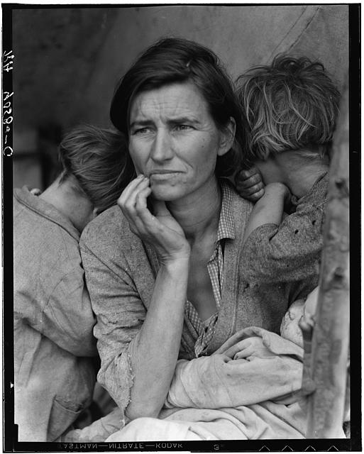
 Migrant Mother.

This photo is a particular favorite of mine, though I've never known its name before today. From my research, it's a Depression-era photo of a mother living in a desert tent with her children, eating only frozen vegetables from nearby fields and birds her children killed.

It is a particularly striking image, I think, because it is in black and white. The era during which this photo was taken was characterized by a metaphorical dark cloud over the previously abundant America. The stark, simple contrast between the subjects and the dull background further implicates the conditions under which they lived.


 This photo is harder for me to explain, in terms of my interest in it, because the contrast is not as artful and the frame is much more cluttered, but something about it just gets me. Yes, it's busy, but look closer. In fact, the only truly busy section of this photo is the middle row of it. The roof and the ground are fairly simple, which only adds to the nostalgic chaos of the storefront. Even in the mess of imagery, there seems to be a balance, and black and white suits it for this reason, because the lack of color equalizes the madness. If there were color, there would be too much chaos, and I think Lange, given the option of color back then, would have understood.
And finally, this photo, which seems almost entirely opposite of the one above. Though the subject is centered, usually a taboo framing for a learned photographer, its unusual triangle shape offsets the awkwardness of the cliche. Even as it is unusual, however, it also seems a very natural position to find this boy in. The contrast in this picture, like the one above, is not as stark as Migrant Mother, but neither is the subject. The focus at the bottom of the picture is sharp, which gives an even more interesting perspective. Also, the contented yet amused expression on the boy's face is classic. This picture would lose a lot of its comfortable simplicity if it were in color, and a lot of its intimacy.


What makes a good black and white image?
I think a photo with good, strong contrast or subject makes a perfect candidate for black and white.

What does your eye gravitate to when color is absent?
Whatever the subject is. Color is usually a distraction and is used in combinations with other colors, but black and white forces you to really take in what a photo is displaying.
 
How does the style of the images (subjects, light, etc) lend to being a good B&W image?
The subject has to be simple and the lighting has to be higher for a good B&W image, because the lack of color contrast can sometimes make it difficult to discern between different elements of a photo, especially if it is too chaotic or complex.

Monday, January 28, 2013

Bro

Hey there. It's me again. We're shifting the focus of this blog from Digital Imaging to Digital Art, which is the class I am in currently. Hope that is not confusing.